The Corporate Logo Singularity
Against the creepy cheerfulness of a thousand smiling san serifs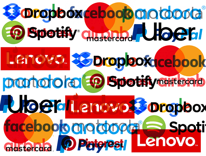 The Baffler
 o
r
d
F
a
c
t
o
r
y
In April, I received an email from the newsletter platform Substack, unveiling its new logo. “If we really put our minds to it,” the email read, “we could probably write a 14,000-word essay about the development process and its deeper meaning, but just this once, we’ll spare you.”
The new wordmark is a nice piece of design—simple, clean, and featuring a bookmark icon demonstrative of the company’s function. It also looks like every other corporate logo in existence.
It’s difficult to pin down the inflection point of a design trend, but 2015 was a banner year for the undeniable winds of change. That June, eleven years after the company’s inception, Facebook released a new wordmark. It was, to the general eye, a very subtle change—the hooked “a” was replaced with a single-story one; the bowls of the letters were widened slightly and rounded out—but it carried significant implications. “This is actually a huge change, and it’s much more than the ‘a,’” branding firm Siegel+Gale’s CCO Howard Belk breathlessly told theWall Street Journalthe day after the rebrand. The new wordmark, Belk said, was intended for easier viewing and loading on the lower resolution of a phone screen, signaling a new consciousness toward mobile users.
Together, their cheerfulness is downright creepy, like the painted-on smile of a clown’s face.
Two months later, shortly after a major restructuring that included the instatement of a new CEO, Google revealed a wordmark remake of its own. Unlike Facebook, Google’s rebrand represented a stark departure from its previous aesthetic, discarding its well-known if archaic serif type for a smooth, geometric sans serif created in-house. The previous wordmark had undergone minor revisions over the years, simplifying and then ultimately scrapping the text shading in favor of a flat look, but its basic concept hadn’t been overhauled since dropping the exclamation point in 1999.?
Like Facebook, the inevitable turn to mobile usage likely motivated Google’s decision to adopt an unshaded sans serif wordmark. In terms of capturing the company’s je ne sais quoi, Google’s designers cited the need to retain the brand’s “simple, friendly, and approachable style” while introducing a “childlike simplicity” into the mix. Writer and architect Jack Self posed a more cynical theory in theGuardian: the redesign (and the wider trend in which it occurred) was completely motivated by the need to increase page-load speeds, representing a step toward austerity rather than feel-good “legibility.” “The Google font is called ‘product sans,’” Self writes, “perhaps a tongue-in-cheek reference to the truth of the matter. Google is the internet, and the product is you.”
By the time Facebook and Google got in on the fun, of course, this new style was well underway. Motorola, Spotify, Airbnb, PayPal, and Lenovo had all undergone similar redesigns; over the next few years, Dropbox, Mastercard, Pandora, Pinterest, and Uber followed suit, among others. The twenty-first century, it became clear, would be smooth, sleek, and simple.
What we’ve been left with is the unsettling omnipresence of a single corporate aesthetic, its reach rapidly expanding beyond its tech origins. Taken individually, any of these wordmarks might effectively communicate the intended qualities of friendliness and approachability; together, their cheerfulness is downright creepy, like the painted-on smile of a clown’s face.
Simplicity has given rise to its own kind of industrial complex. Siegel+Gale’s tagline is “we believe in the power of simplicity”; in their New York headquarters, an entire department is dedicated to the simplification of brand identities. As Howard Belk told the American Institute of Graphic Arts’ magazine in 2016, “if consumers view a brand as complicated, they feel it’s being complicated on purpose, or trying to take advantage of them. They won’t trust them as much. That’s why consumers now are demanding simpler and clearer experiences and relationships, because they feel more honest.”
Here, the truth is made plain: the childlike nature of corporate branding isn’t a random trend, but part of the mindset that consumers ought to be treated like children. Details are the sinister machinations of faceless authority figures; friendly colors and geometric letters like those on a toddler’s building blocks are comforting by contrast. That each brand looks more or less like the next is only for the better: the world is a little smaller that way, less likely to confuse or frighten. As Jesse Barron wrote for Real Life magazine in 2016, “We’re in the middle of a decade of post-dignity design, whose dogma is cuteness.” Cuteness, employed as these companies do, talks down to you without words.
Then there is the idea that simplicity signals trustworthiness. This is, of course, misguided—the devil doesn’t actually need that much detail to hide in. But the central aesthetic function of the minimalist-kindergarten-utopia style is to euphemistically downplay the increasingly terrifying amount of power that multinational corporations and tech companies wield over us. Airbnb surely doesn’t look like a company that would engage in a nationwide “guerilla war” with local governments to get out of paying taxes, does it? Nor does Facebook, which pairs its wordmark and key branding with a cartoony style of flat illustration, project the image of a company that would conduct mass nonconsensual surveillance of its users and hand the data off to right-wing operatives. And yet.
The central aesthetic function of the minimalist-kindergarten-utopia style is to euphemistically downplay the increasingly terrifying amount of power that multinational corporations and tech companies wield over us.
In the end, this simple, friendly design is only a stopgap, as the eventual goal of many companies employing it is to serve so many functions for so many people that trying to opt out of their platforms entirely would be prohibitively difficult. Amazon has been one of the most successful in this pursuit, beginning as an online bookstore, and becoming, within twenty-five years, a massive e-commerce retailer, consumer electronics manufacturer, digital content subscription service, streaming platform, and supermarket chain. In a world where such rapid expansion is possible in a relatively short period of time, adopting the singular corporate aesthetic is a way of projecting ubiquity, or at the very least, the intention to reach it. Specificity is ill-suited to the dream of amoeba-like growth.
But this trend has begun to show signs of souring. A resurgence of serif type (previously believed to be a casualty of millennials’ relentless killing spree) is afoot among some fledgling brands, riding on a wave of distinction from the now-oversaturated style that came before it. These new wordmarks aren’t “childlike” or “approachable,” and they definitely aren’t simple, at least by the standards set by the singular corporate aesthetic. On the contrary, they seem to take delight in their excesses, be they large, strong serifs or lettering with heavy contrast between strokes.
This isn’t a coincidence. As Eliza Brooke writes, brands are consciously moving “away from the possibly fascist undertones of the grid layout” that has recently so characterized corporate logo design. But what does it mean to find comfort in an aesthetic intended to placate you in a different way? It might amount to sheer relief from the boredom of living in a world that looks like it contains a single graphic designer. The serif-y design wave is too broad to have inspired homogeneity yet, and while it might eventually be narrowed down to a point, the nature of the type will be harder to replicate into ubiquity. The definite hint of nostalgic longing in this newest trend is similarly unspecified: some of these wordmarks harken back to the seventies while others have earlier roots, but the outmoded feel of each suggests a desperation to live in any moment other than the present one.
For now, logos that shy away from minimalist infantilization remain the province of niche, hip startups and young brands. While their growing numbers indicate dissatisfaction with the singular corporate aesthetic, the end of its grasp is not yet in sight. Companies like Facebook and Google have made their bed and will likely have to lie in it for the next decade or two. So long as geometric sans serifs with bright, flat colors can put a happy veneer on their exploitation, they likely won’t mind. The movies got it all wrong—corporate dystopia is horrifying, but it will surely look very cute.